
 ... love this one! by far my favorite fortune to date. it's a keeper... have a fun weekend everyone! :)
Showing posts with label paper love. Show all posts
Showing posts with label paper love. Show all posts
a little {big} fortune...
... love this one! by far my favorite fortune to date. it's a keeper... have a fun weekend everyone! :)art history...
 ... loving this poster by vuk vidor! wonder how long it took to come up with these three-word combos...
VIA DESIGN MILK | IMAGE FROM THIRD DRAWER DOWN
new in the shop!
 ... signature gift wrap for thank yous, notecards + notepads! just in time for the holidays. plus i've loaded up the second edition of the holiday goodie bag, they were sold out on its first week!
on more of a personal note... i'll be departing for hong kong tonight to visit my grandma, who's 94. i'm not going for vacation, but rather a trip that i need to make. i hope she will get well soon and that i can brighten up her spirits. will be back posting again on dec 7. have a wonderful thanksgiving holiday everyone! :)
it's here!
 ... first edition of my holiday goodie bag! filled with lots of offset + letterpress yumminess. hope you enjoy them as much i do! click here to view more images...
holiday sneak peek...
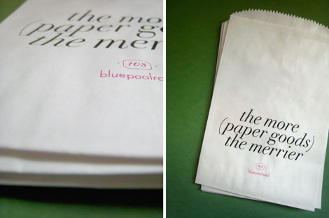 ... off to chicago for a long weekend! but wanted to leave you with a little preview of my holiday goodie bag. i'll be rolling out the holiday line next week! happy weekend :)
agendas...
 ... i've decided that for 2010 i'm going to have two agendas: 1. my muji stable (same design as the 2009 one, so happy!) 2. the kate spade "just to have". illustrations by bella foster are so charming + whimsical... i couldn't resist!
lovely design


 ... finally got my very own address file from lovely design! filled with lots of fun + colorful paper cards. makes me happy just by looking at it! :)
discus...


 loving these prints by rachel castle. hand screen printed with acrylic. hard to choose just one...
IMAGES FROM CASTLEANDTHINGS.COM
filed under /
a collection of artwork,
objects,
paper love,
textures,
type + color,
wish list
0
comments

ink calendar

 ... by spanish designer oscar diaz. a bottle of colored ink spreads across a sheet of paper embossed with numbers, coloring them in as it goes. the color is supposed to relate to our perception of the weather of that particular month. how amazing is that concept? i just love how it looks... the ink calendar is currently on exhibit at the círculo de bellas artes in madrid. read more about this project here.
IMAGES FROM DEZEEN.COM
may-belle!


 the most gorgeous package arrived today from maybelle imasa-stukuls. i don't think i've ever opened a piece of mail so delicately before. she even calligraphed bluepoolroad on a card for me! love. love. love. can't wait to work on a project together – thanks for all the goodies maybelle! :)
visual collages from nss
although i only had a day and a half at the national stationery show this year, the most enjoyable thing about walking the show was to meet many of the designers whom i've been admiring from afar. it's been quite a few years since i last attended. i was really excited to be there as a new business owner this time around. everyone was so generous with their time, advices, ideas... a big thank you to you all!!! :)
here's my take on the show – visual collages of my favorites. enjoy + happy memorial day weekend!
 first stop: paper + cup. something about p + c that just makes me smile. minhee and truman are such a lovely lovely couple. couldn't resist the white type on black walls! their new line of greeting cards takes me back to when i used airmail envelopes and aerograms as a kid. like i said, they make me smile.
 and two doors down was egg press! hard to believe they are celebrating their tenth anniversary already! it was definitely a kodak moment when i saw kara and the girls in their aprons, had to get a shot of that! and for some great behind the scenes footage of their design + printing process, check out their new video "egg press work and whirl". it will open your eyes...
 next up is my very personal favorite, sugar paper. if you are ever in los angeles, you have to stop by their store. it will not disappoint, i promise! i was like a kid at a candy store when i walked into their booth. instantly fell in love with their new illustration print called "westside kate", done by their very own caity knox, which of course they call her the westside kate. and the gold foil on hot pink... delish. a little personal note here to chelsea, jamie + lindsey: so great to catch up and see all your new gorgeous work! love, love, love! xo
 it seriously took my breath away when i spotted austin press. such a joy to see something so clean amidst those mile-long hectic aisles. adore the simplicity of it all. kimberly is a true artist. double bonus: bumped into grace from design*sponge there! (if you haven't read grace's write-up on bluepoolroad, click here!)
 just as i was thinking to myself, where is chronicle books...? and there it was! my all time favorite publishing house. as luck would have it, the first person i met at the booth was their in-house designer, kristen. gosh, what a treat! :) later i spotted the new labels + stickers from oh joy! studio and lotta jansdotter. can't wait to get my hands on those!
 second day was off to a great start. viola from chewing the cud and joy (momma bird) from flybird press was full of sweetness! what a perfect collaboration between the two. the yellow wall they had was so cheerful. i love the whole woodsie / bird / love nest theme here. aborable.
 how brilliant is that wall? to me that just says it all. i had an amazing time chatting with liz and katie from linda & harriett. i've been such a long time fan of liz that perhaps i was a bit star struck when i finally met her... i almost drank her coffee! i can really see liz's bright personality in her work, which was really what drawn me to her note cards in the first place, always so vibrant + happy.
 it was one of those moments when you know you are destined to meet someone. i was chatting with jane from simple + pretty (love her!) by the entrance when i saw the cutest little girl running around with her dad. of course i had to say hello. it turned out the dad is the husband of valerie, owner + designer of pikku! every little detail of valerie's booth was perfect. i especially love how she displayed the wrapping paper. and the white quilt? wow.
 enormous champion. love saying that name. the charming duo: jordan + jason. their booth was full of whimsy! i love the fact that they rescued a shelving unit from their neighbor and put it into good use – painted it gray and voilà! really, how adorable are those wooden animals?
 first thought: nursery rhymes made modern. these posters designed by sub-studio really caught my eye. and then i found out why: anna and sean are both architects! something about these posters that reminded me of building blocks. and when i looked over, sitting pretty was anna's jewelry line, brevity. again, it's those shapes... love them!
 so many precious little things at linea carta! my favorite is the shower savers, "every drop counts". it's meant to be hung on the shower head as a cute reminder to conserve water. diva does all her own illustrations + calligraphy!
 well, all good things must come to an end. i closed the show with hammerpress, and really couldn't have asked for more! it was great fun getting to know lindsay + brady. plus shared our love for all things muji. they even let me style my pictures for the blog, but really, no styling was needed! a-ha moment: (office depot) clipboards + hammerpress prints, brillant.
here's my take on the show – visual collages of my favorites. enjoy + happy memorial day weekend!
 first stop: paper + cup. something about p + c that just makes me smile. minhee and truman are such a lovely lovely couple. couldn't resist the white type on black walls! their new line of greeting cards takes me back to when i used airmail envelopes and aerograms as a kid. like i said, they make me smile.
 and two doors down was egg press! hard to believe they are celebrating their tenth anniversary already! it was definitely a kodak moment when i saw kara and the girls in their aprons, had to get a shot of that! and for some great behind the scenes footage of their design + printing process, check out their new video "egg press work and whirl". it will open your eyes...next up is my very personal favorite, sugar paper. if you are ever in los angeles, you have to stop by their store. it will not disappoint, i promise! i was like a kid at a candy store when i walked into their booth. instantly fell in love with their new illustration print called "westside kate", done by their very own caity knox, which of course they call her the westside kate. and the gold foil on hot pink... delish. a little personal note here to chelsea, jamie + lindsey: so great to catch up and see all your new gorgeous work! love, love, love! xoit seriously took my breath away when i spotted austin press. such a joy to see something so clean amidst those mile-long hectic aisles. adore the simplicity of it all. kimberly is a true artist. double bonus: bumped into grace from design*sponge there! (if you haven't read grace's write-up on bluepoolroad, click here!)just as i was thinking to myself, where is chronicle books...? and there it was! my all time favorite publishing house. as luck would have it, the first person i met at the booth was their in-house designer, kristen. gosh, what a treat! :) later i spotted the new labels + stickers from oh joy! studio and lotta jansdotter. can't wait to get my hands on those!
 second day was off to a great start. viola from chewing the cud and joy (momma bird) from flybird press was full of sweetness! what a perfect collaboration between the two. the yellow wall they had was so cheerful. i love the whole woodsie / bird / love nest theme here. aborable.how brilliant is that wall? to me that just says it all. i had an amazing time chatting with liz and katie from linda & harriett. i've been such a long time fan of liz that perhaps i was a bit star struck when i finally met her... i almost drank her coffee! i can really see liz's bright personality in her work, which was really what drawn me to her note cards in the first place, always so vibrant + happy.
 it was one of those moments when you know you are destined to meet someone. i was chatting with jane from simple + pretty (love her!) by the entrance when i saw the cutest little girl running around with her dad. of course i had to say hello. it turned out the dad is the husband of valerie, owner + designer of pikku! every little detail of valerie's booth was perfect. i especially love how she displayed the wrapping paper. and the white quilt? wow.
 enormous champion. love saying that name. the charming duo: jordan + jason. their booth was full of whimsy! i love the fact that they rescued a shelving unit from their neighbor and put it into good use – painted it gray and voilà! really, how adorable are those wooden animals?
 first thought: nursery rhymes made modern. these posters designed by sub-studio really caught my eye. and then i found out why: anna and sean are both architects! something about these posters that reminded me of building blocks. and when i looked over, sitting pretty was anna's jewelry line, brevity. again, it's those shapes... love them!
 so many precious little things at linea carta! my favorite is the shower savers, "every drop counts". it's meant to be hung on the shower head as a cute reminder to conserve water. diva does all her own illustrations + calligraphy!
 well, all good things must come to an end. i closed the show with hammerpress, and really couldn't have asked for more! it was great fun getting to know lindsay + brady. plus shared our love for all things muji. they even let me style my pictures for the blog, but really, no styling was needed! a-ha moment: (office depot) clipboards + hammerpress prints, brillant.
Subscribe to:
Posts (Atom)